Date:Jan 15, 2024
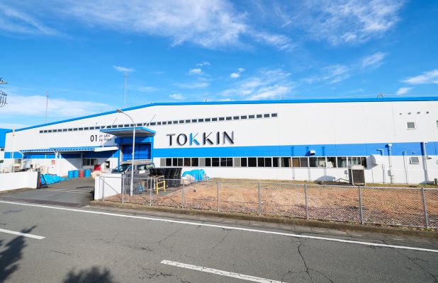
TOKKIN has renewed its corporate logo and color.
We renewed our corporate logo and colors from the days of its predecessor company, Tokushu Kinzoku Kogyo.Co, Ltd., to strengthen its branding strategy for its corporate stance of "Responding to diverse changes and creating various added values" to become an "Excellent company" that will last for a 100 years.
The corporate logo expresses our strengths: outstanding technologies, flexible thoughts, complex combinations, changes and evolution.
In addition, We have also created a different version of the standard logo (TOKKIN) that combines the waveform of a pulse signal to represent the power of cooperation between organizations to overcome the rough and tumble of business.
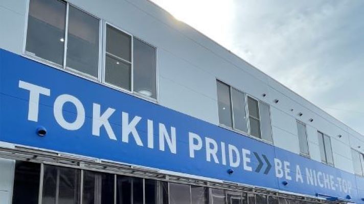
The corporate colors are Royal Blue to symbolize "Sincerity, Calmness, Inquisitiveness, solitude (be a Niche-Top) and Intuition", and Black to symbolize "Never wavering from anything"
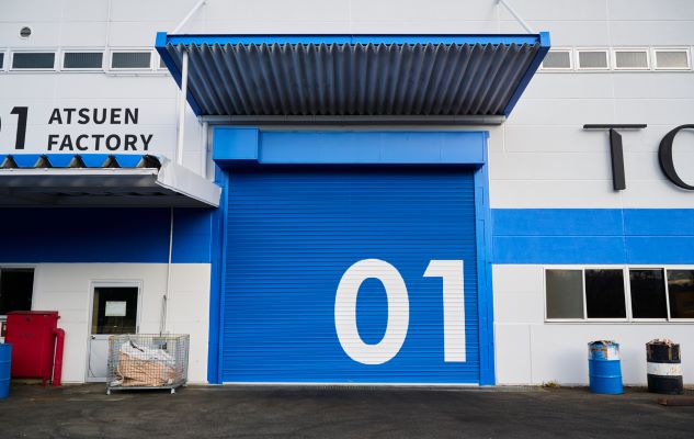
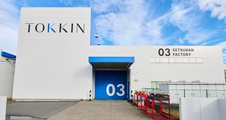
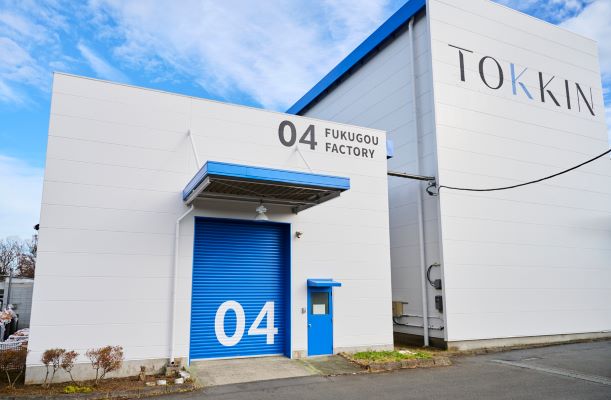
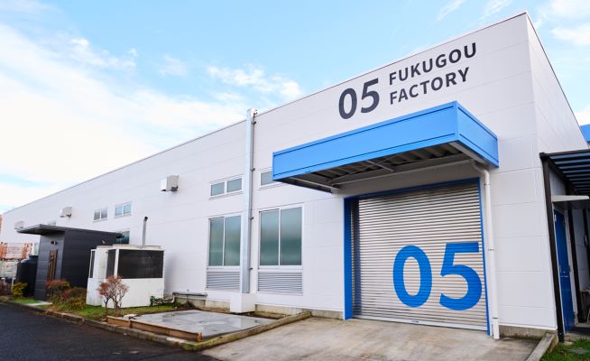
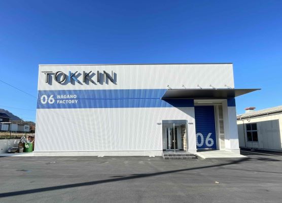
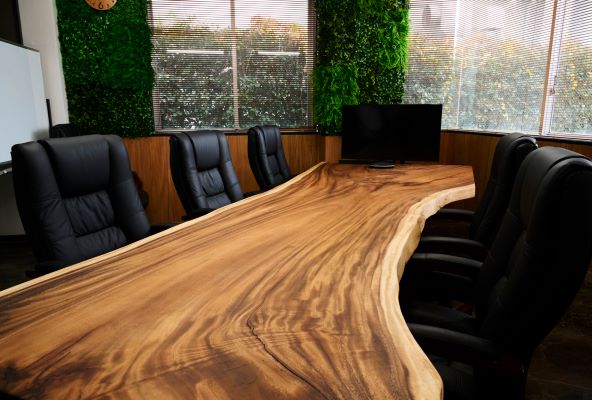
Following the renewal of the corporate logo and colors, the interior and exterior of the factories were also renewed.
The interior is richly decorated with wood with an awareness of the local forestry industry. The exterior is based on the corporate color blue, and each factory building is assigned a number from 01 to 06 to promote a branding strategy at all locations.